Back in late 2014, 10tons was heavily focused on mobile and PC and we did only 2D games. As PS4 and Xbox One opened up to smaller developers we ported a lot of games over to these consoles. The ports did quite well and it was clear that we’ve succesfully entered a new market. So, we wanted to do something hat would be a good product for PCs and consoles.
Enter Neon Chrome, the first 10tons game with full 3D graphics, and the first shooter since Crimsonland. In fact, 10tons was founded because Crimsonland became a small cult hit and the finances had to be handled somehow. So, in a sense we’ve ventured back towards our roots with the new PC & console focused games like Neon Chrome and the upcoming space shooter Xenoraid.
There was one problem though: Our game engine was well suited for 2D mobile games, but lacked the features and tools to create 3D games. We’ve always loved to create our own tools and we’ve been able to be among the first on many platforms because we haven’t had to wait for the middleware to be ported.
We considered Unity and Unreal Engine but in the end we decided to start building 3D support into our own engine since we already had a solid base with a really nice UI framework and loads of other nice tools. Reasons were mostly practical and rational but we also love our own tech – at least most of the time. We could delve into the engine stuff more but that’ll be a topic for another post.
Own engine or not, we knew that our small team of 1 lead programmer, 1 main designer/co-programmer, 1 artist, 1 level designer, 1 engine/tools guy can’t compete with the output power of larger teams. We had to choose an art style which would fit the team, the game, and the tech we’d be using.
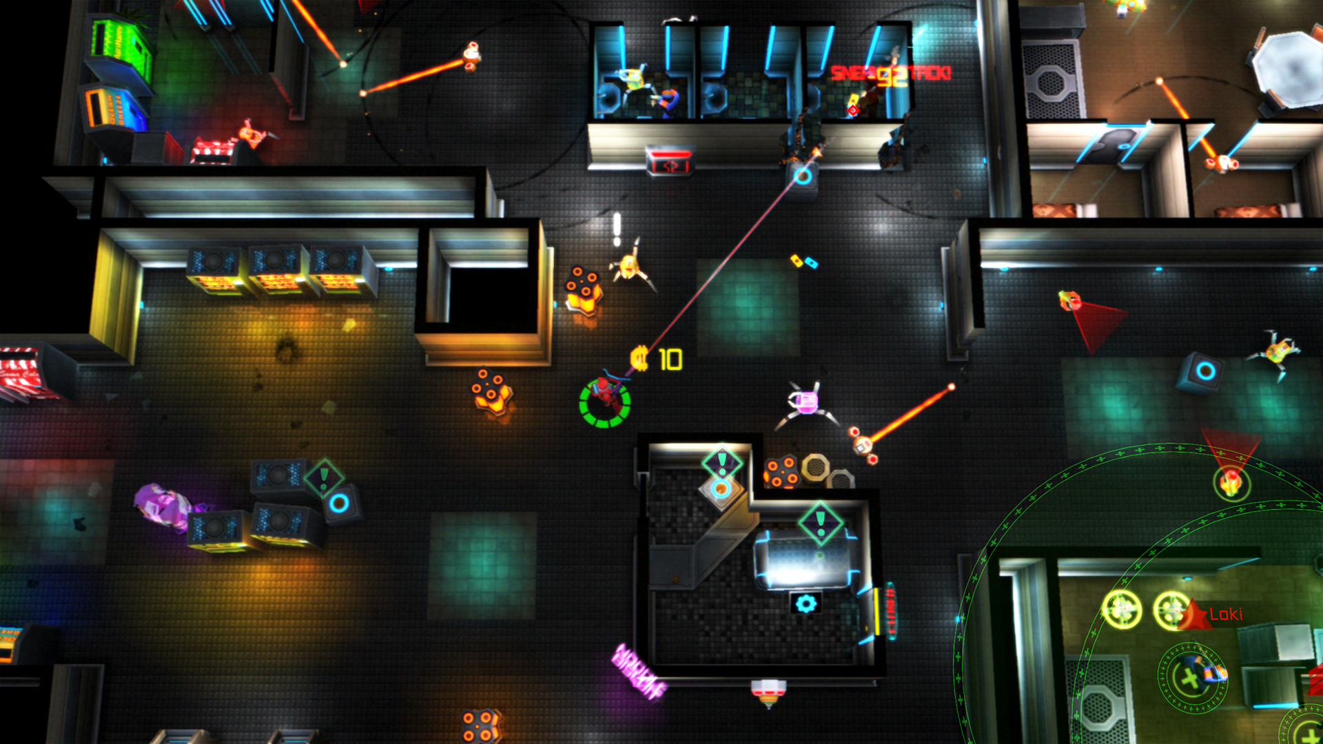
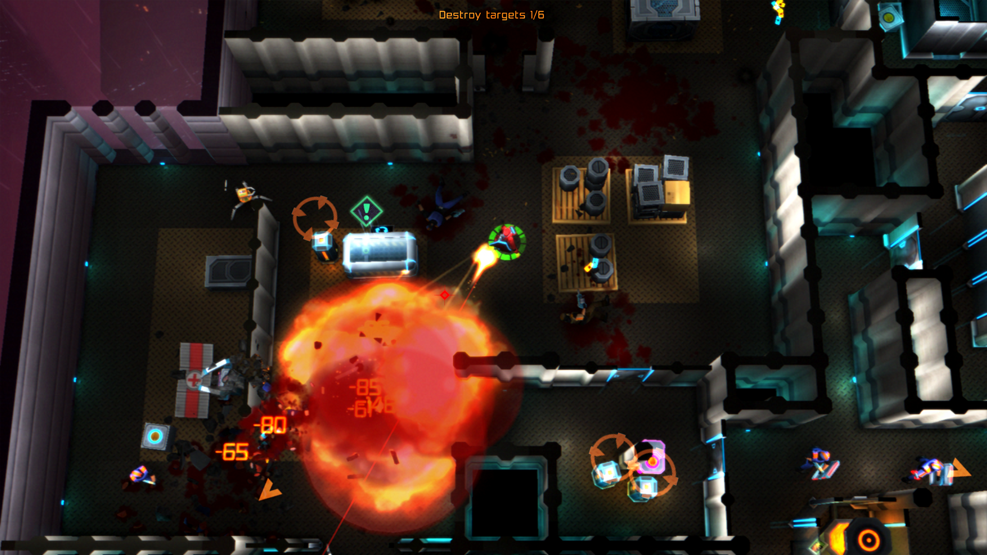
With Neon Chrome we wanted to create a top-down shooter which would be actually mostly from “top-down perspective” and we also wanted to have a large field of view in order to give the player some room to plan – not only to react. With these game parameters you also need less polygons and fine surface details.
As a result, we decided it was safer to go with low-poly assets, only diffuse and glow maps, and as simple rigs as possible. This limitation also served as the base requirement for the art style.
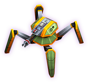
One of our inspirations was the XCOM2 and somebody probably said something like: “A bit like XCOM2 but maybe we can go more simple”. We also wanted to have around 20-30 skinned actors on screen at the same time and some other parameters like that which also determined some boundaries for our work. The resulting style is quite low poly and stylized but still conveys a sense of a real world.
The semi-realistic style would also help us deliver smooth gameplay on a larger variety of platforms. You can actually play Neon Chrome on a 3-year-old Macbook Pro in 1920×1080 and 60fps if you switch of some of effects like reflections. This is something which isn’t actually that common if you try a few dozen games on Steam. Despite the nice performance we think the game still looks very good. Our chosen style would also keep the engine feature set manageable and we could imagine creating all necessary stuff within the expected production timeframe. Also, it would be possible to run some customized version of the game on a mobile device at some point.
So, we wanted a simple, semi-realistic art style that would look good on both large and small screens, and that the world should have vibrant colors. Blade Runner and Ghost in the Shell are obviously huge influences. Especially the GitS movies have such amazing backgrounds, colors, and designs it’s hard not to fall in love.
While generic cyberpunk worlds look dreary and decayed, it wasn’t something we wanted to focus on with Neon Chrome. There are already a lot of games which try to recreate the decayed, dirty, and dark dystopian look. That said, some scenes might be more into that direction and there are many classic elements like nearly constant rain and lots of neon signs.
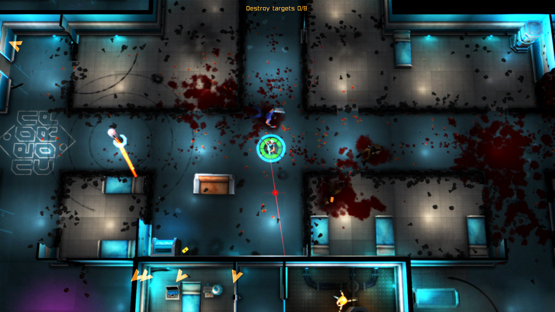
As we’re creating a top-down shooter, many visual aspects were hugely influenced or even determined by the gameplay requirements. One of the main things from gameplay is probably the fact that almost everything you shoot or use has some kind of neon light on it. You can distinguish these bright spots quite easily from the background and you can spot your targets even in total darkness.
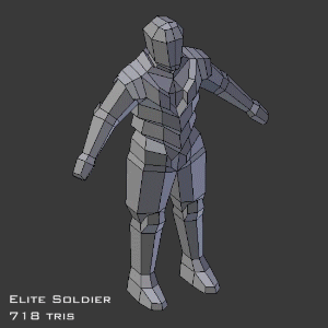
So with the engine being very simple and with the team being very small, certain methods had to be used to make models look as good as possible in the shortest possible time. We used a subsurface modifier on the low-poly mesh to create a temporary “high-poly” version, which was used for baking ambient occlusion, and shadows cast by an area light floating over the model to simulate the environment. The resulting map was added to the diffuse map, saving a lot of time otherwise spent on painting the shadows by hand.
Another trick used on almost every model in the game was adding a mild gradient to the texture, leaving the bottom part of the model slightly darker to simulate depth. This is especially useful on humanoids, so you’re less likely to be distracted by the legs, as seemingly normal animations can look odd when viewed from above.
The simplicity of the engine and the requirements of the game set some limitations, but some of them actually made the look more unique. For example, using only vertex lighting meant that we would not have to skimp on the number of light sources, which contributes a lot to the overall aesthetic. Also, simple game objects made it easy to create gibs and alternate versions to reflect damage done to the environment. As a result, we have managed to create a quite beautiful and a very dynamic game world.